
Solar Supremacy — Building an Analog-Sci-Fi Universe
The Brief Following my work on Pan Am and Jurassic Park, I was commissioned by Helios Games to define the visual identity for Solar Supremacy. The goal was to move away from the cold, dark aesthetics of typical space strategy games and create something that felt like a "future classic"—warm, tactile, and deeply nostalgic.
The Vision: "Analog Sci-Fi" I leaned into a 1950s vision of the future. I utilized a palette of "dirty" pastels, high-contrast primary accents, and heavy ink textures. This "Analog Sci-Fi" approach ensures the game feels grounded and human, even as players build interplanetary empires.
The UI/UX Challenge: The "Total Solution" In a heavy strategy game, the art must never get in the way of the data. My process involved:
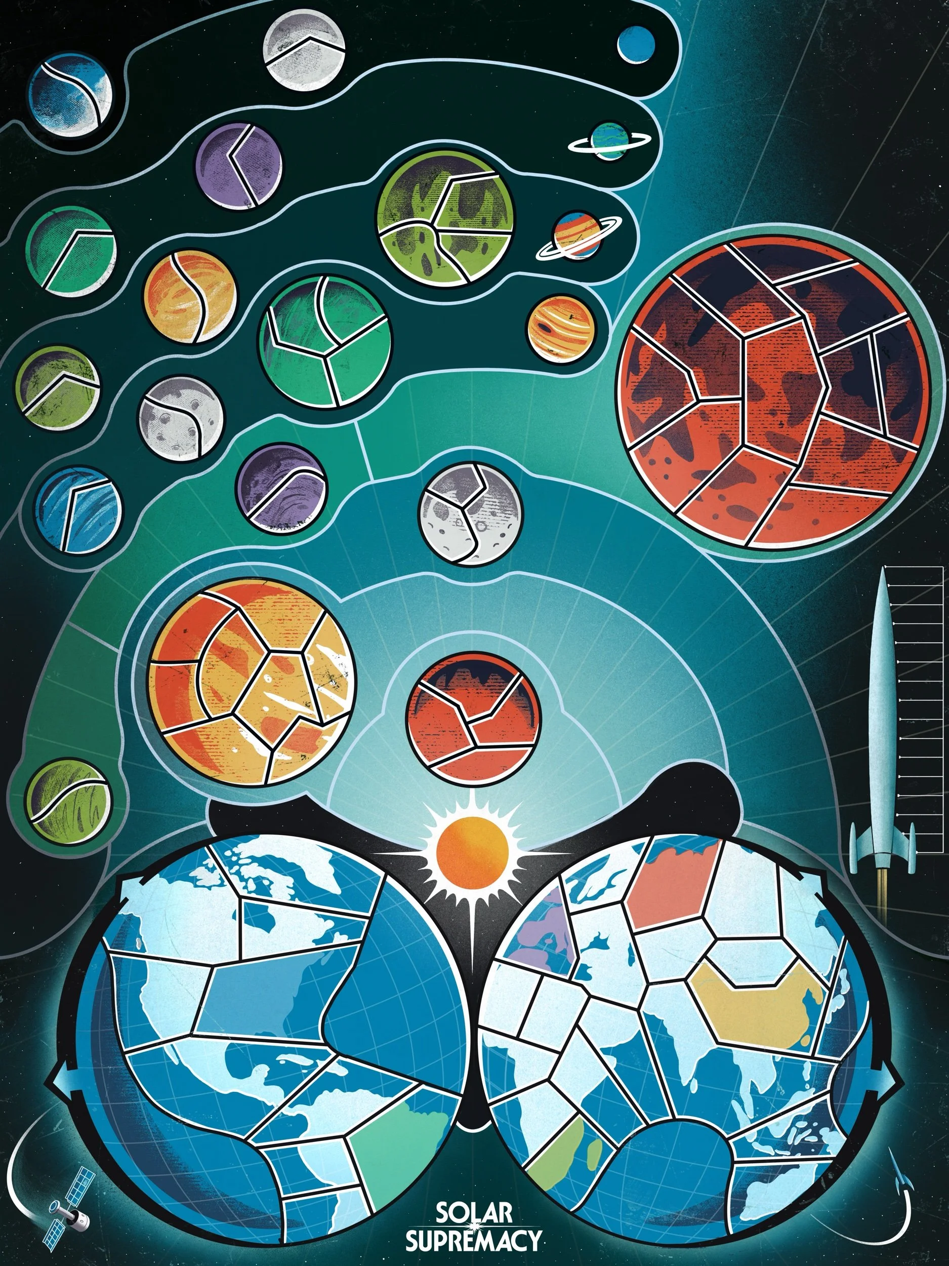
Functional UI: Designing player boards where the "hero" art and the resource tracks exist in harmony.
Integrated Hand-Lettering: Every title and UI element was hand-lettered to ensure the typography felt like a physical part of the game world, not a digital overlay.
Visual Hierarchy: Using color and line weight to guide the player's eye toward critical gameplay information without sacrificing the immersive "mid-century" atmosphere.
The Result A cohesive tabletop experience that bridges the gap between high-end illustration and functional game design. Solar Supremacy is a testament to how "Modern Nostalgia" can be used to make complex systems feel intuitive and inviting.
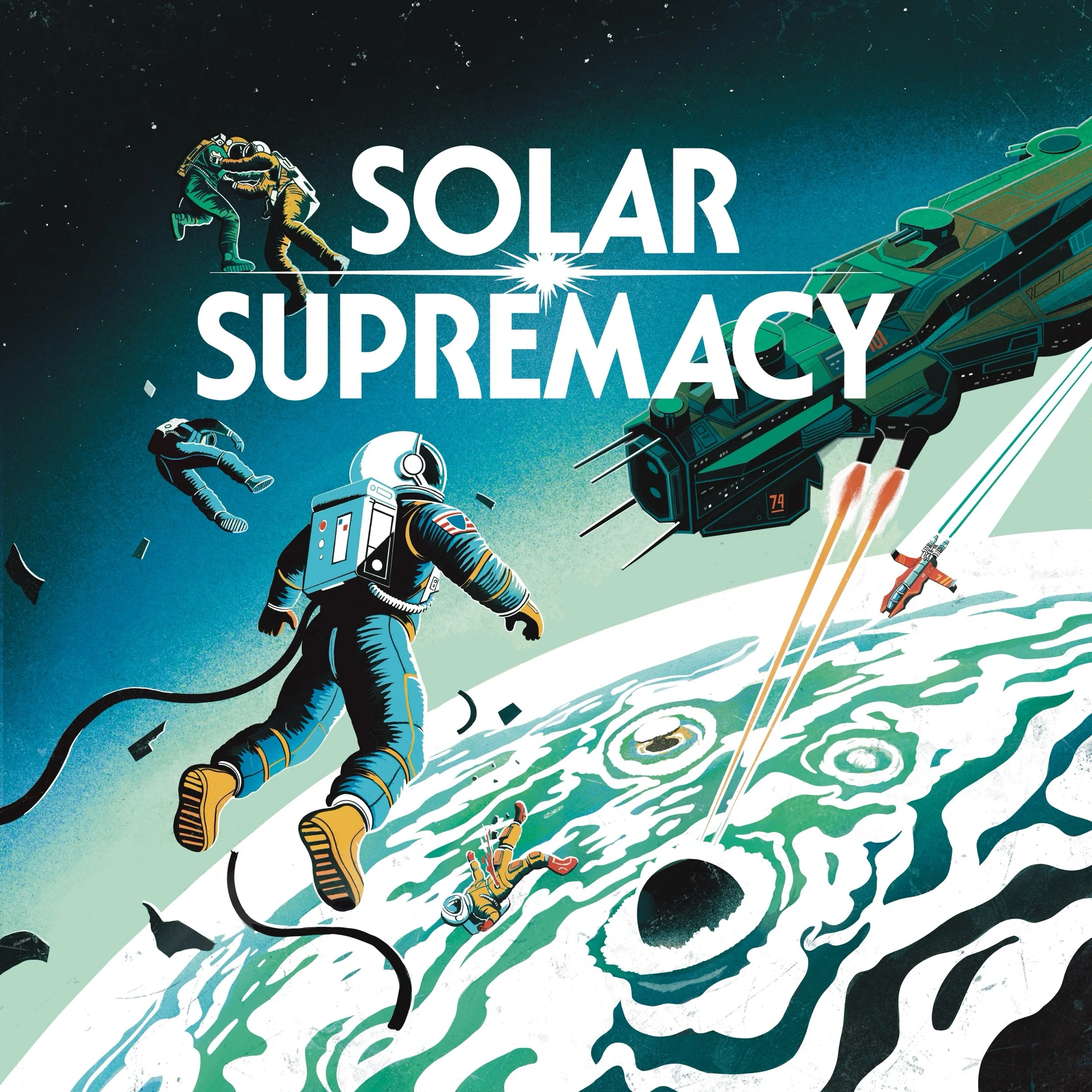
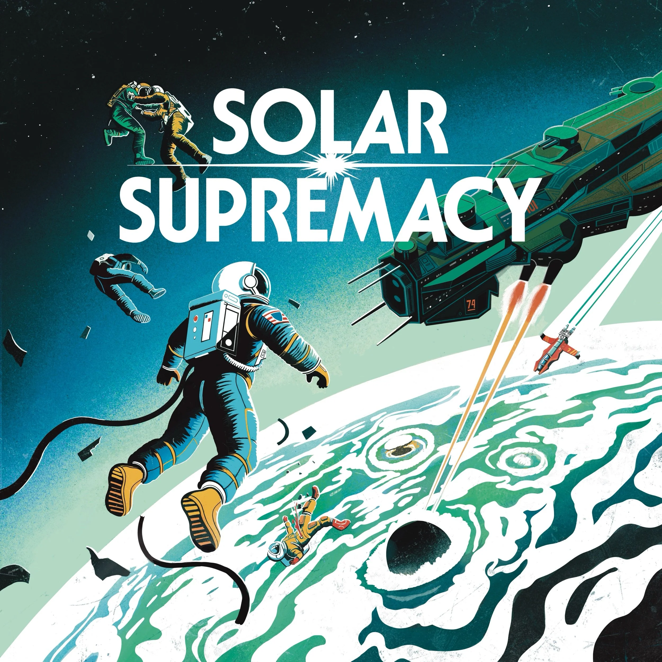
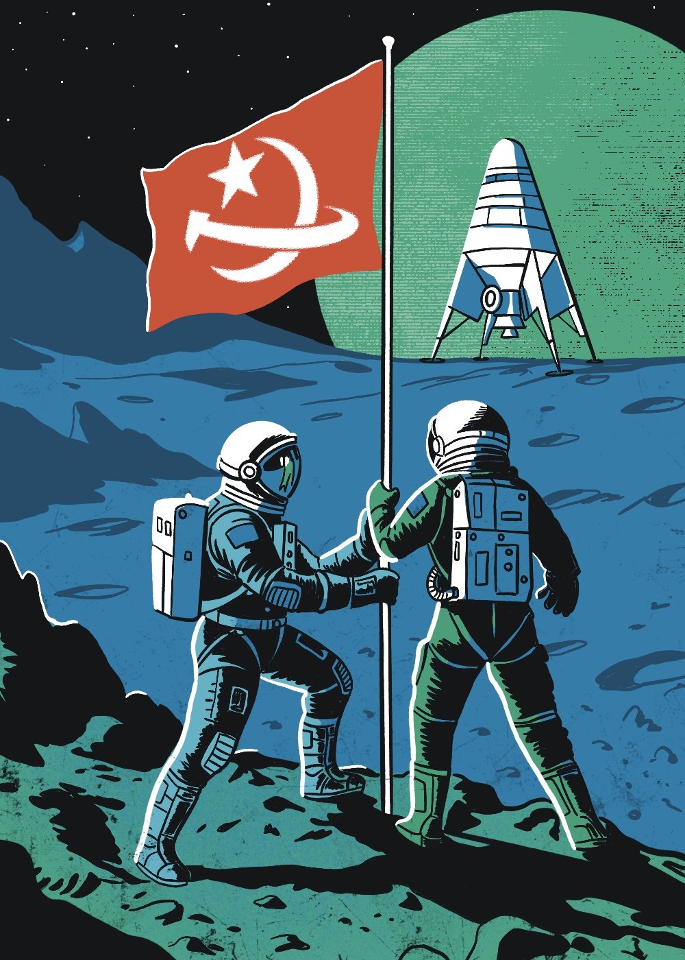
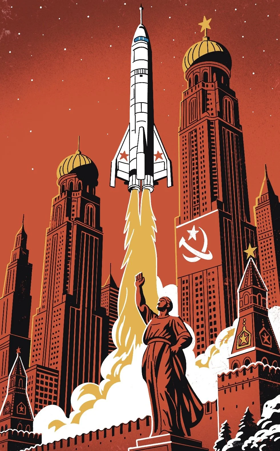
Nostalgic, mid century, classic science fiction cover. Logo lettering and illustration.
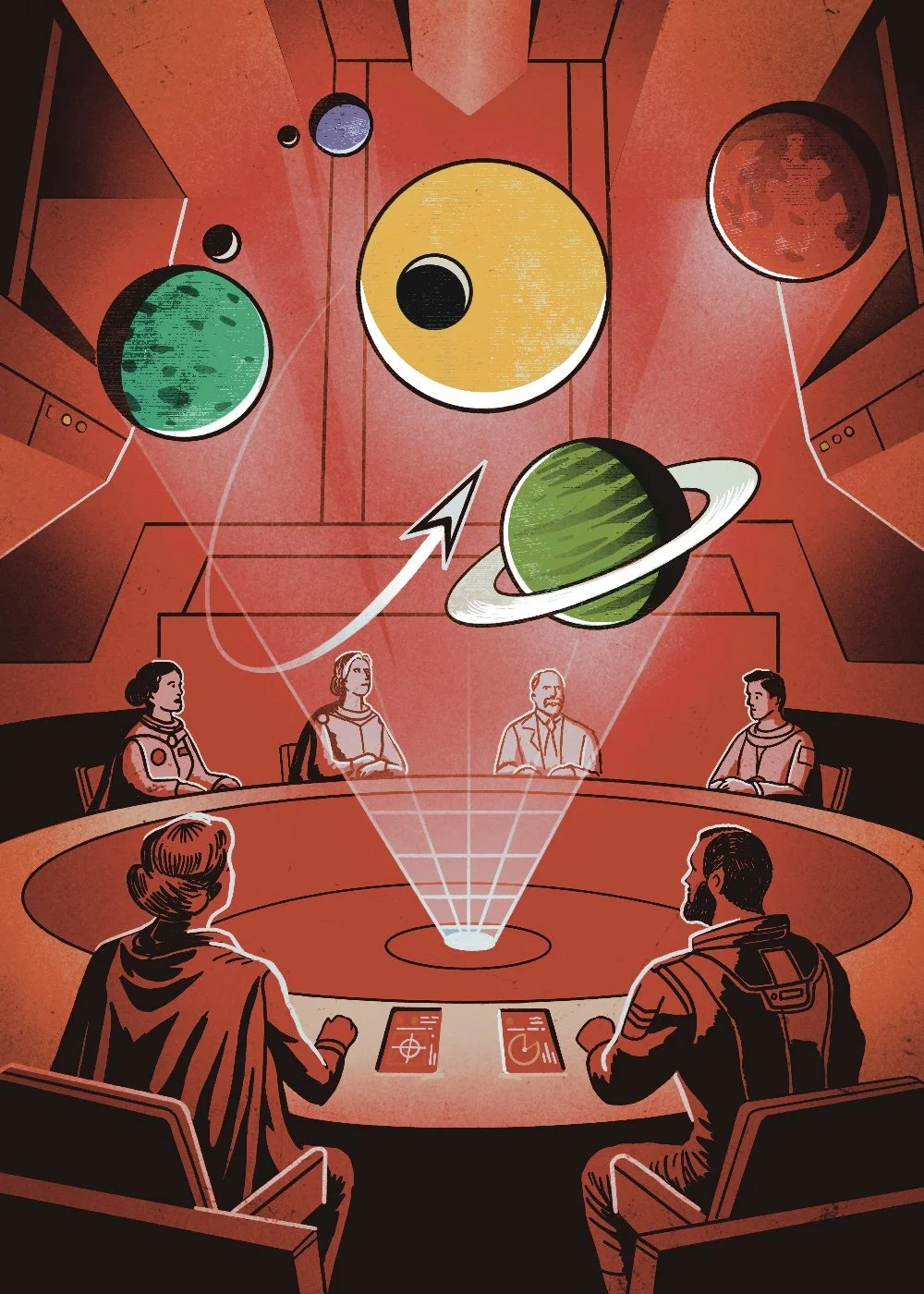
Boardgame board design and illustration. Nostalgic mid-century science fiction style. Controlled limited colour palette.
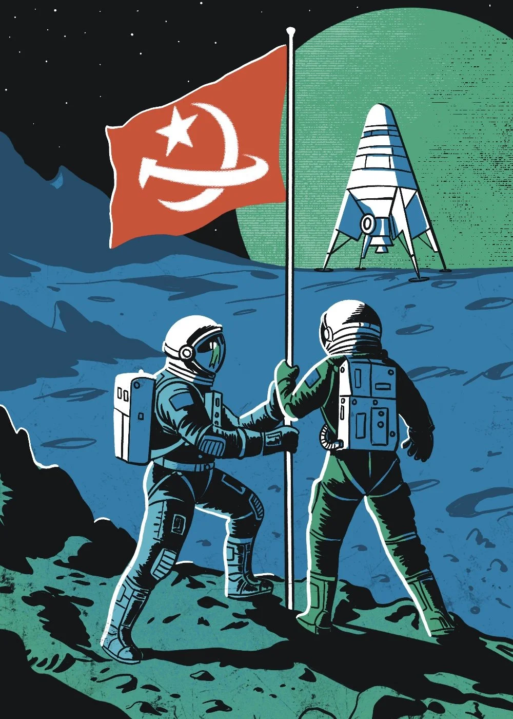
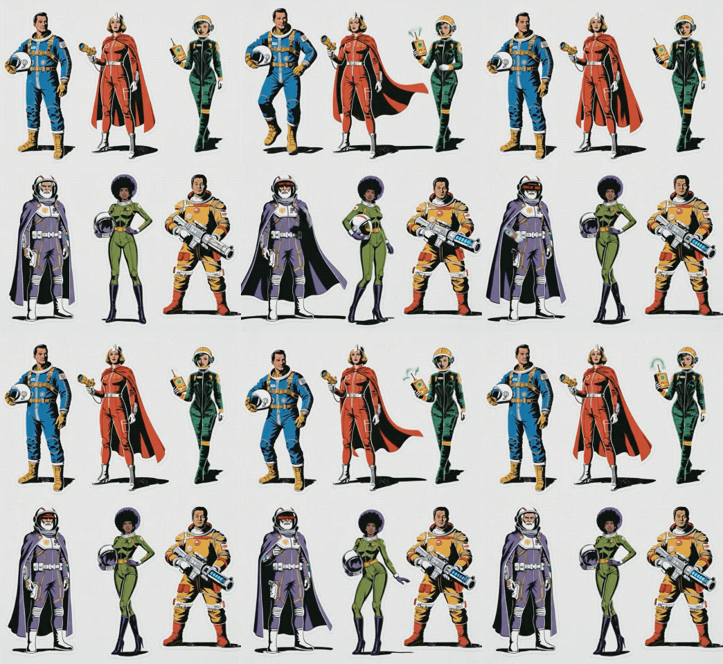
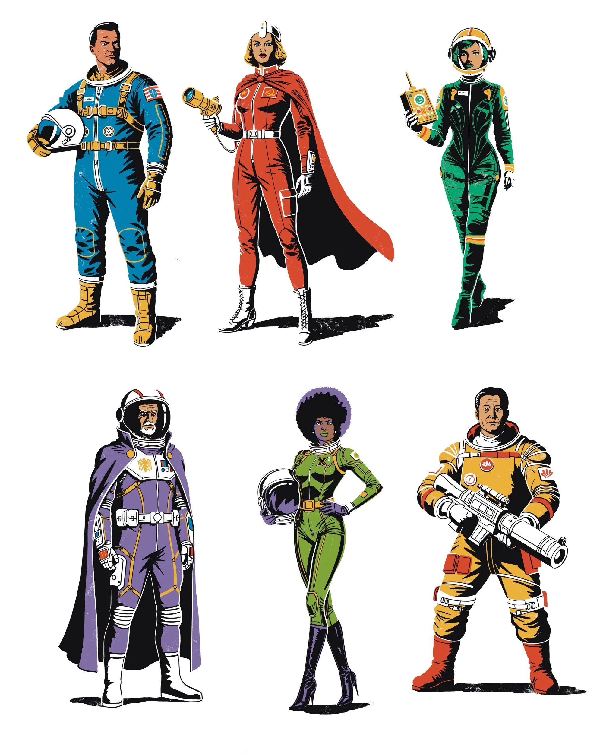
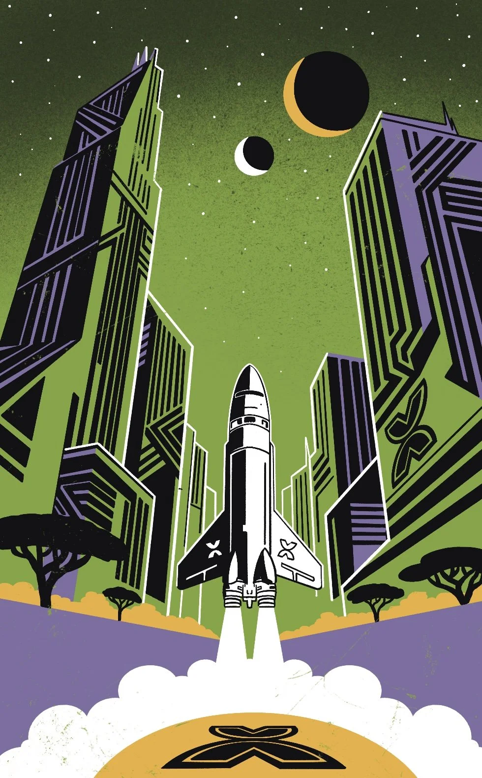
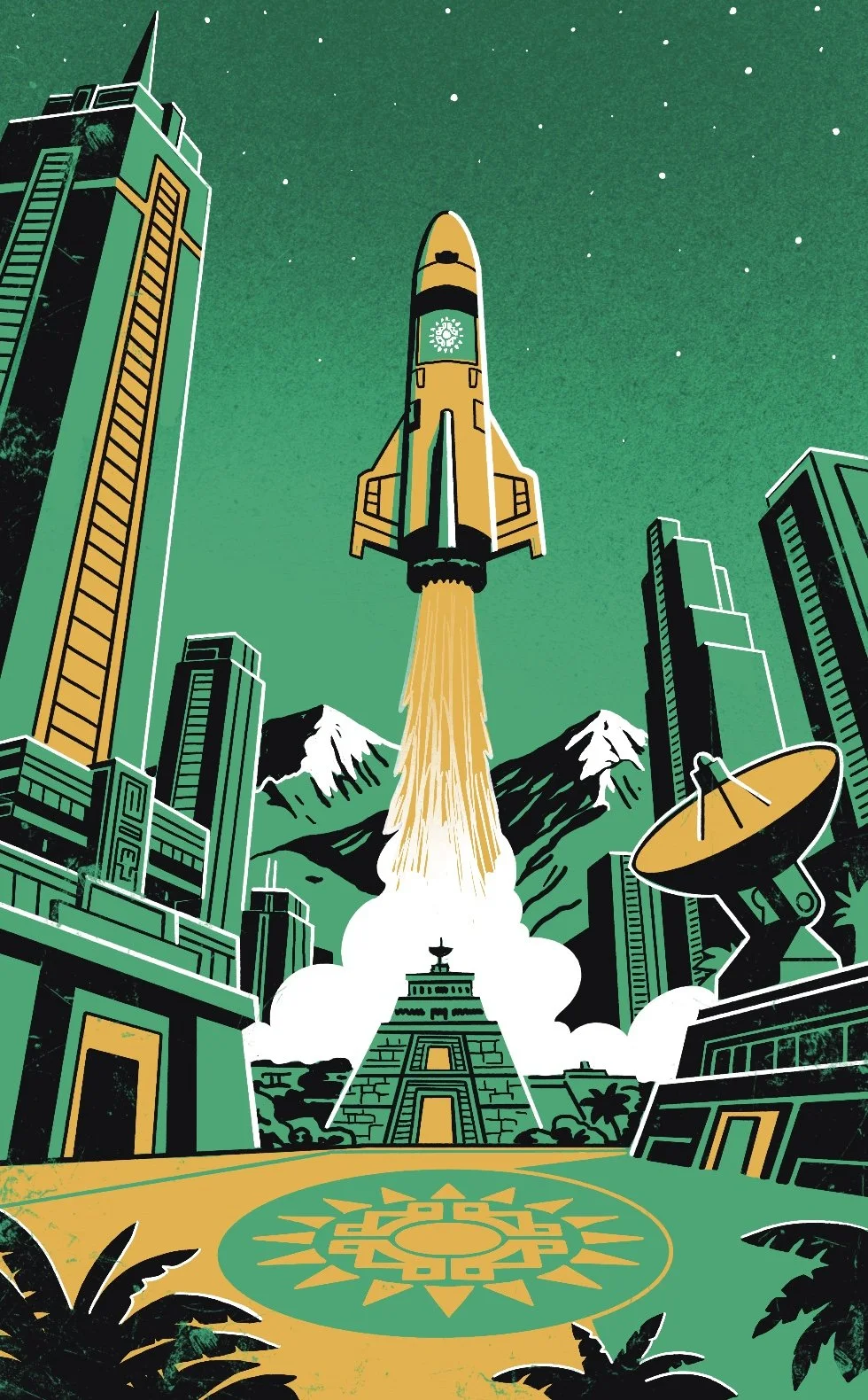
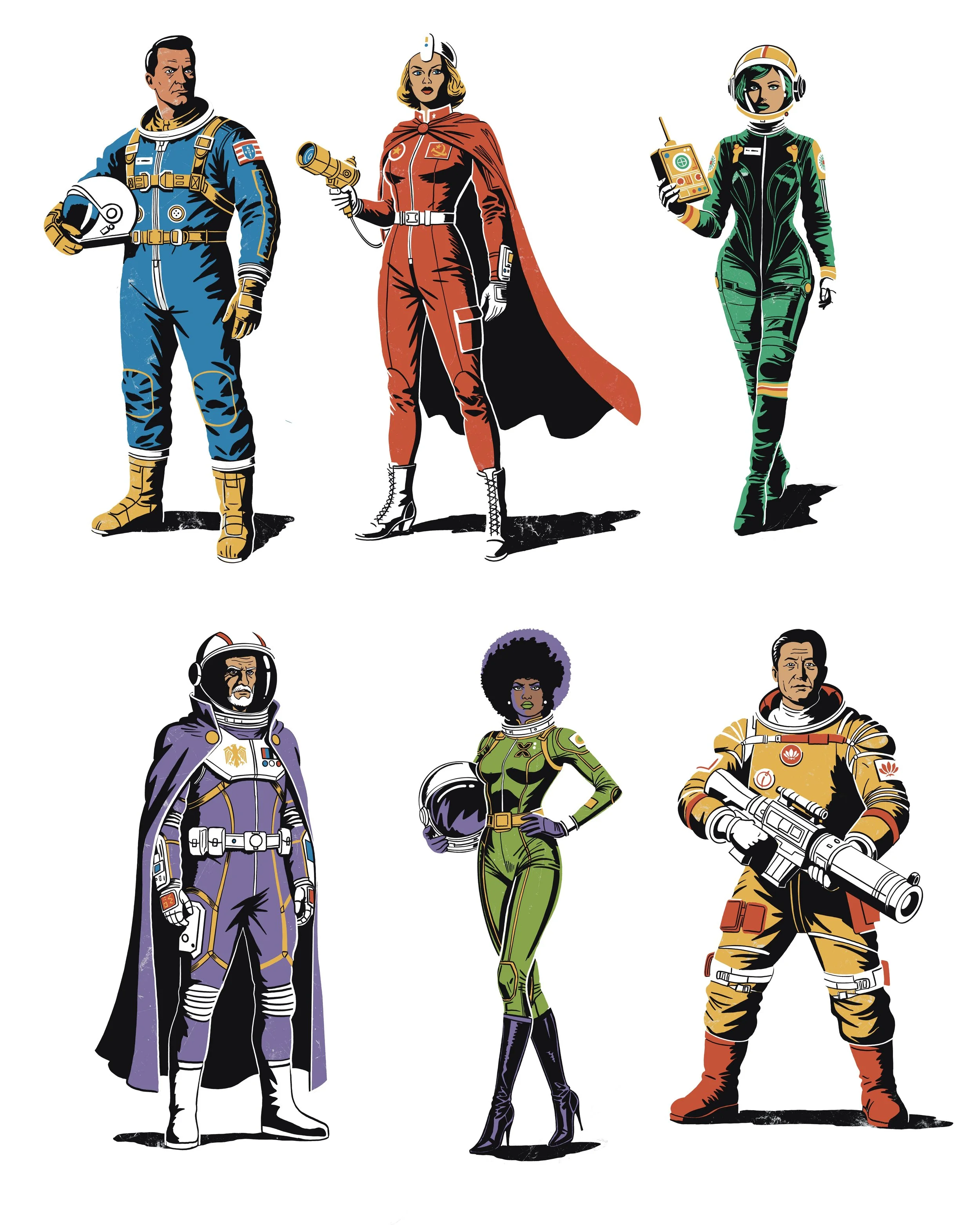
Character design for classic science fiction board game. Colours represent separate factions within game. Nostalgic mid-century look and feel
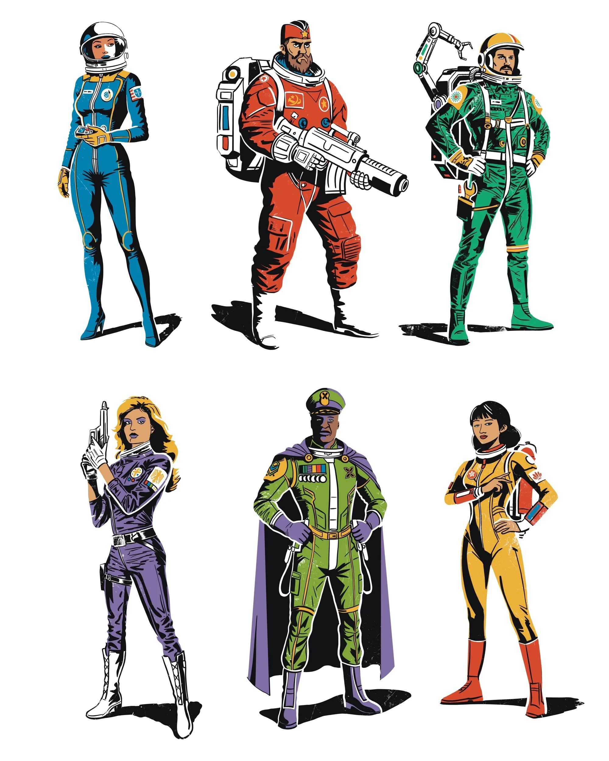
classic science fiction board game card illustration. Colours represent separate factions within game. Nostalgic mid-century look and feel
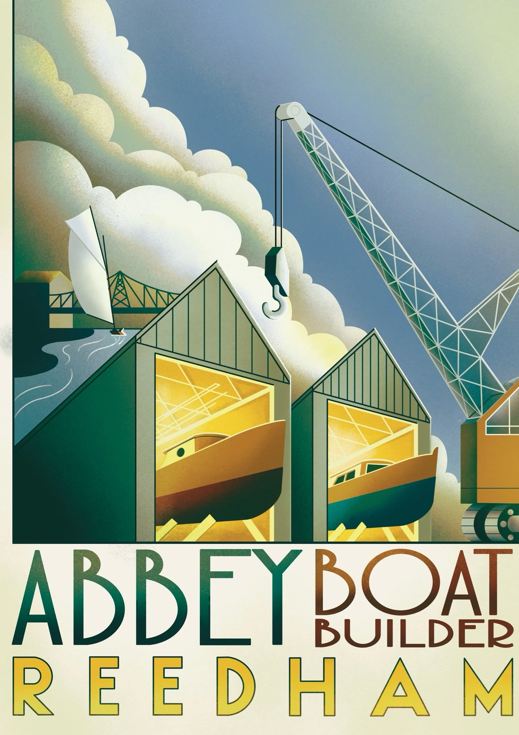
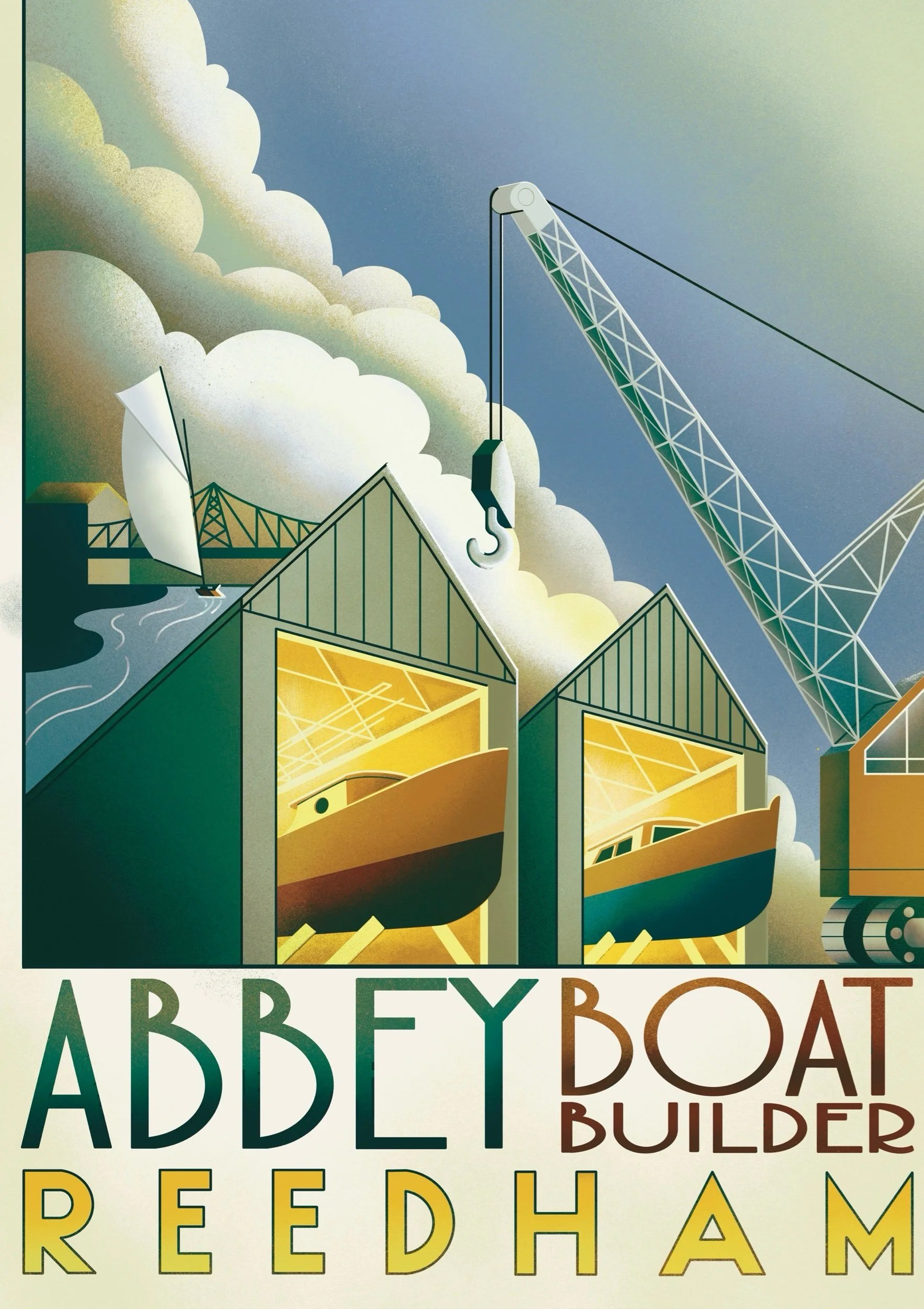
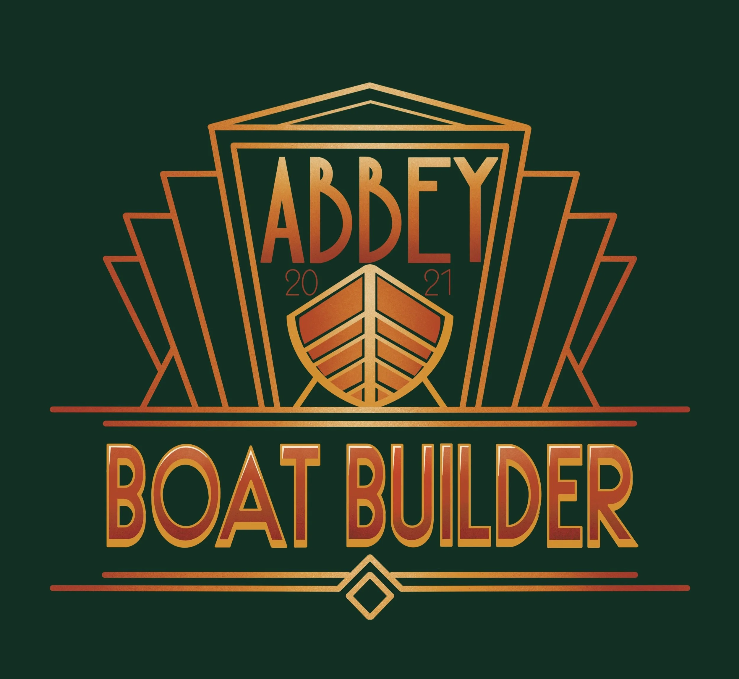
A nostalgic art deco-style poster was commissioned to commemorate Abbey Boat Builders’ new boat house. Additionally, a themed 1930s-style logo was designed to enhance the brand’s identity.
Abbey Boat builder poster created in a nostalgic art deco, 1930s style. Hand crafted lettering to give that nostalgic lived in feel
Hand made logo created for Abbey Boat Builder, Lettering design and art deco hand made feel
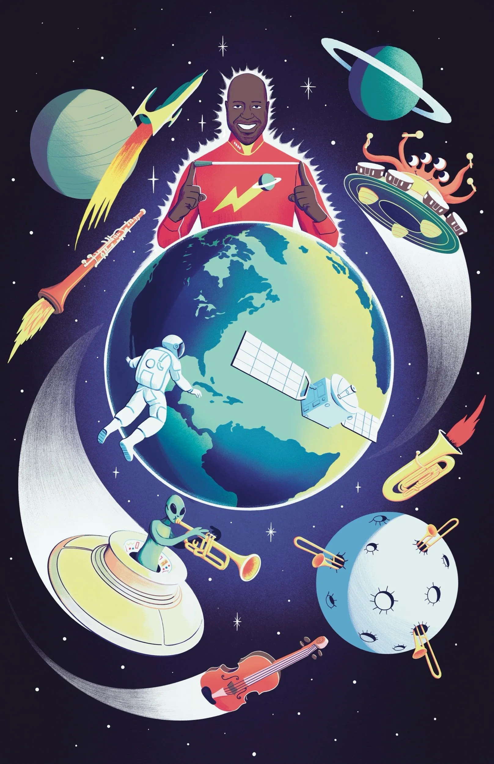
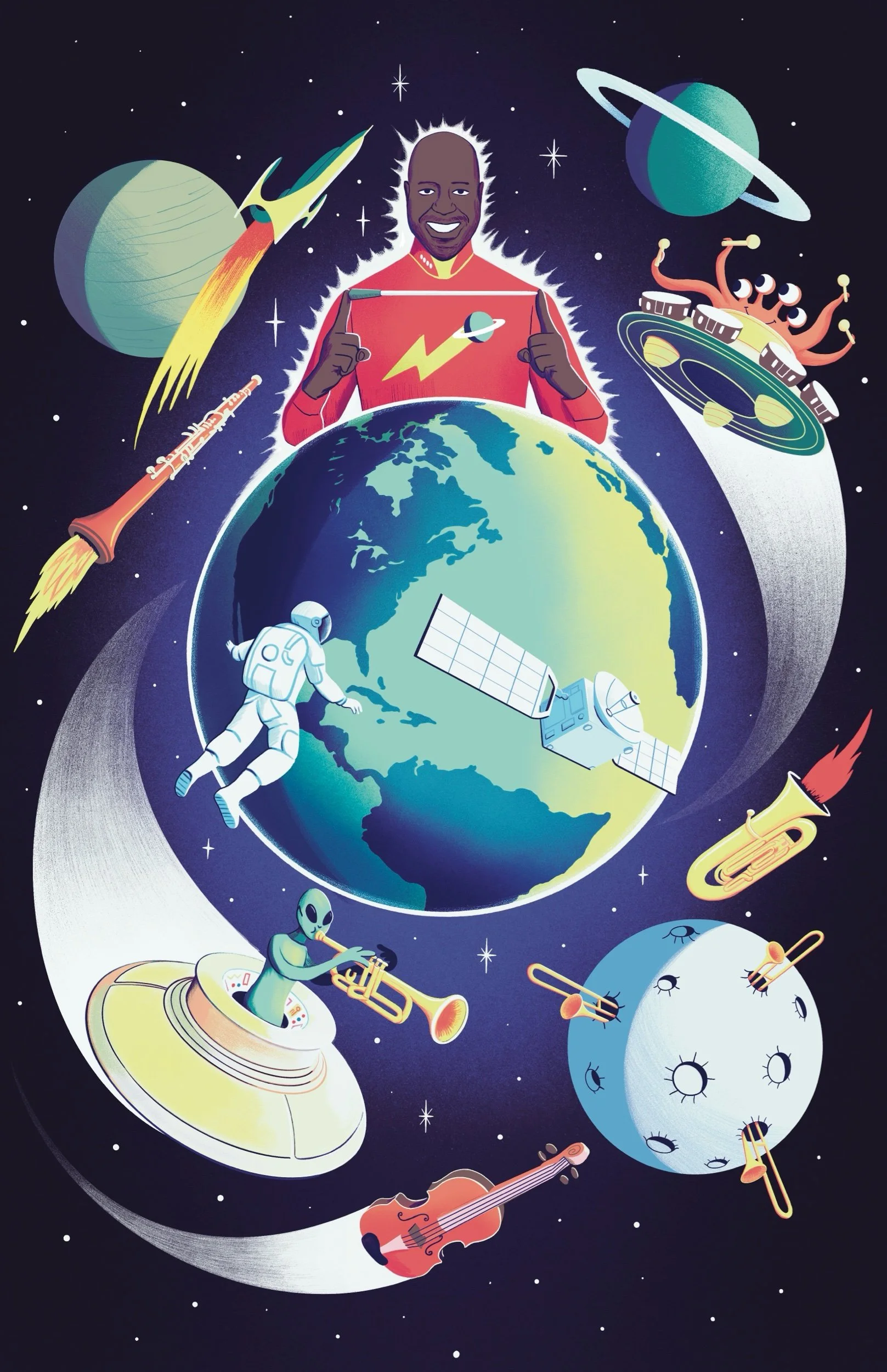
Poster created for the NAC in Canada.
Prepare to blast off with the NAC Orchestra on an intergalactic musical adventure! Experience the thrill and wonder of science fiction brought to life through dazzling works including John Williams's theme from Star Wars, Jesse Montgomery's Starburst, and Debussy's Clair de lune. This cosmic journey will ignite your imagination and take you to the stars and beyond!
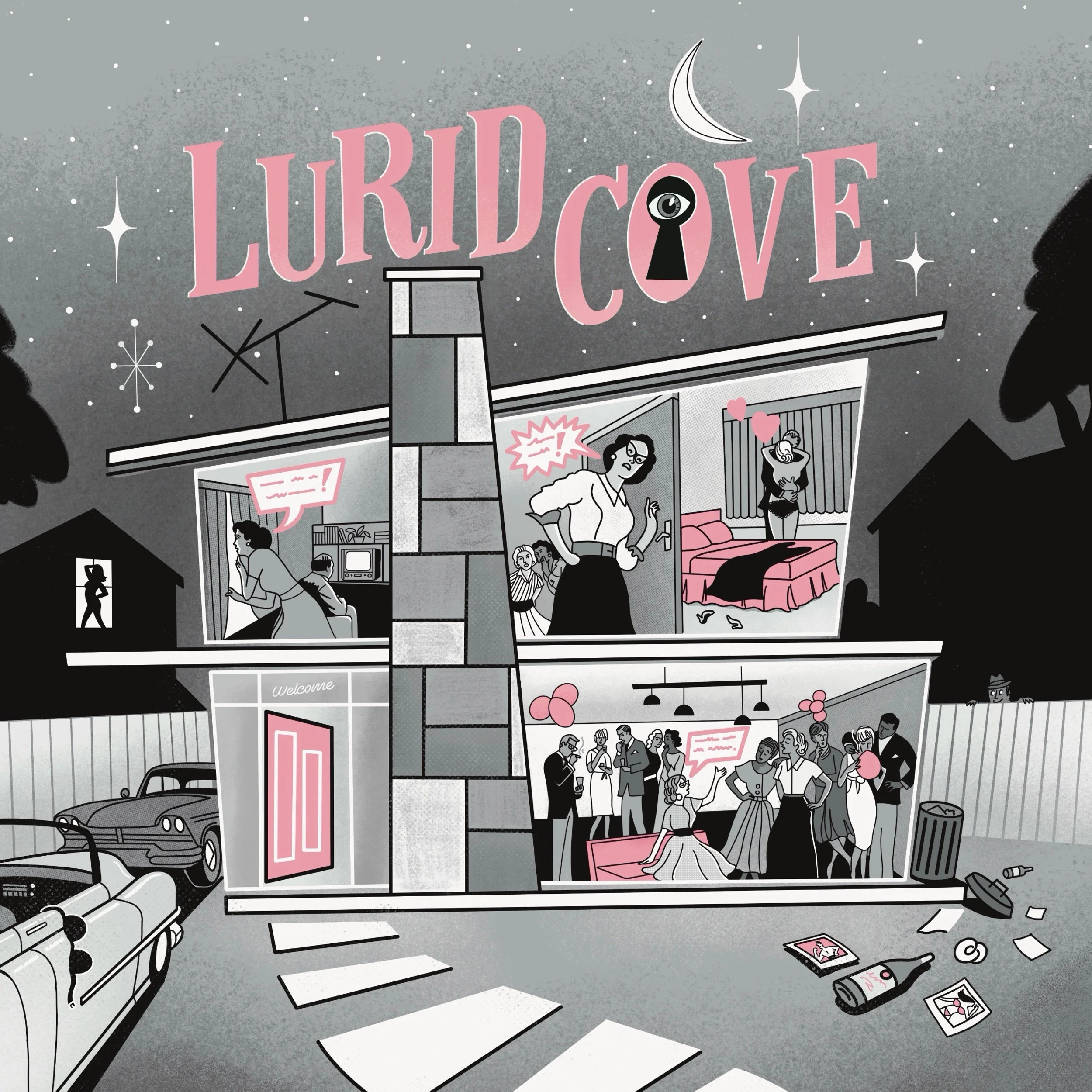
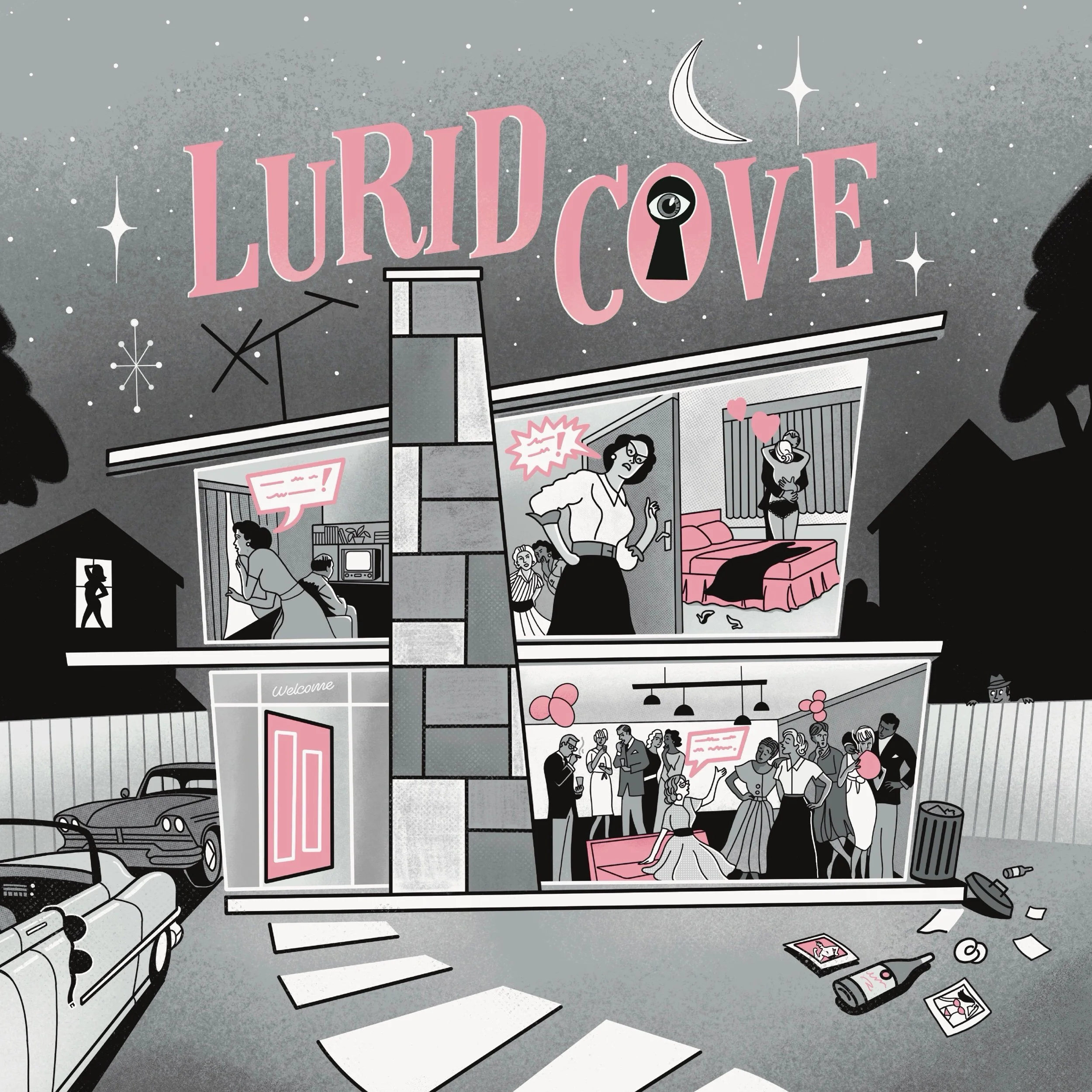
Take yourself back to the 1950s suburbia with this gossip and scandal ridden new boardgame Lurid Cove. Heading to Kickstarter spring 2025. Cover illustration and lettering by yours truly.
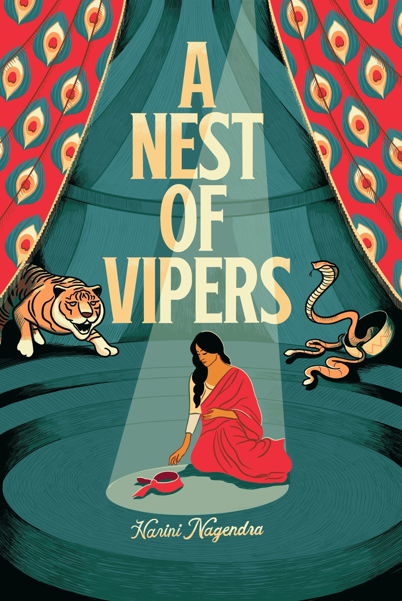
Cover illustration and lettering design created for Harlequin publishing
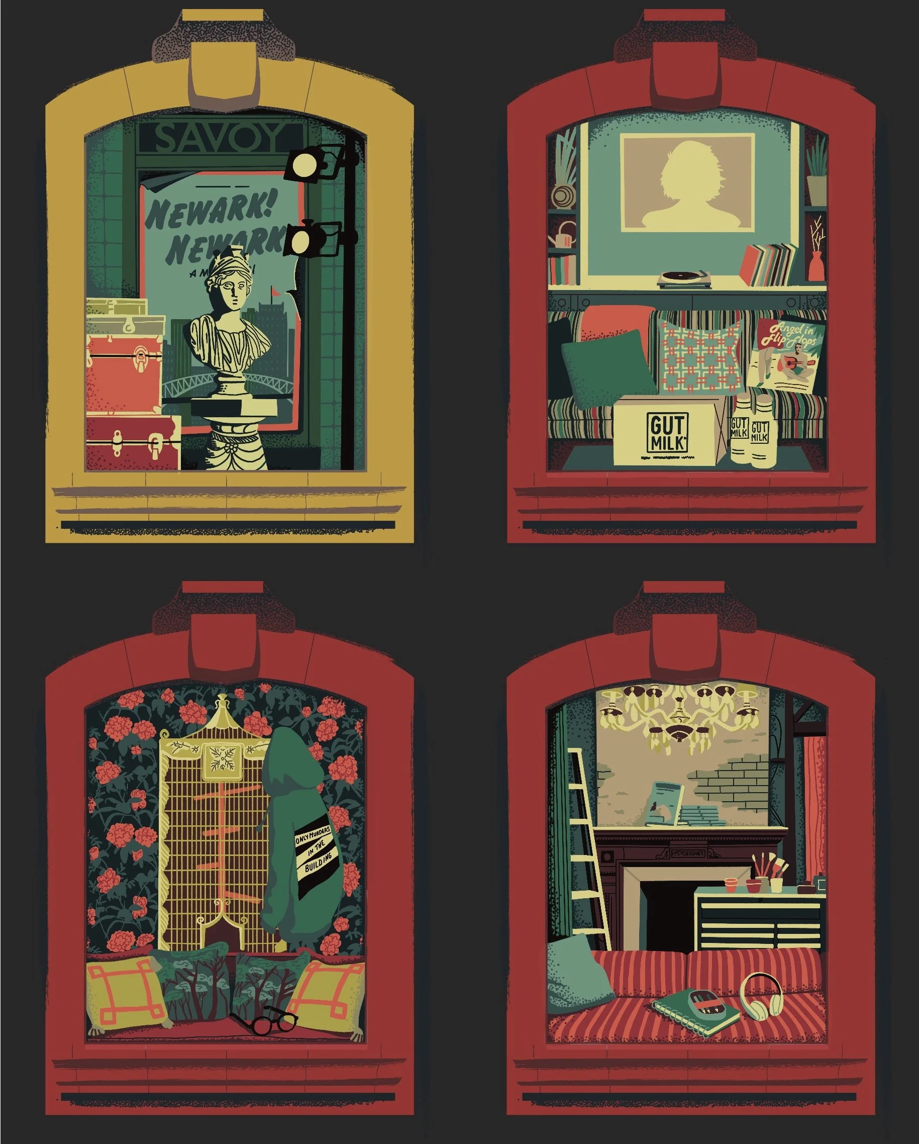
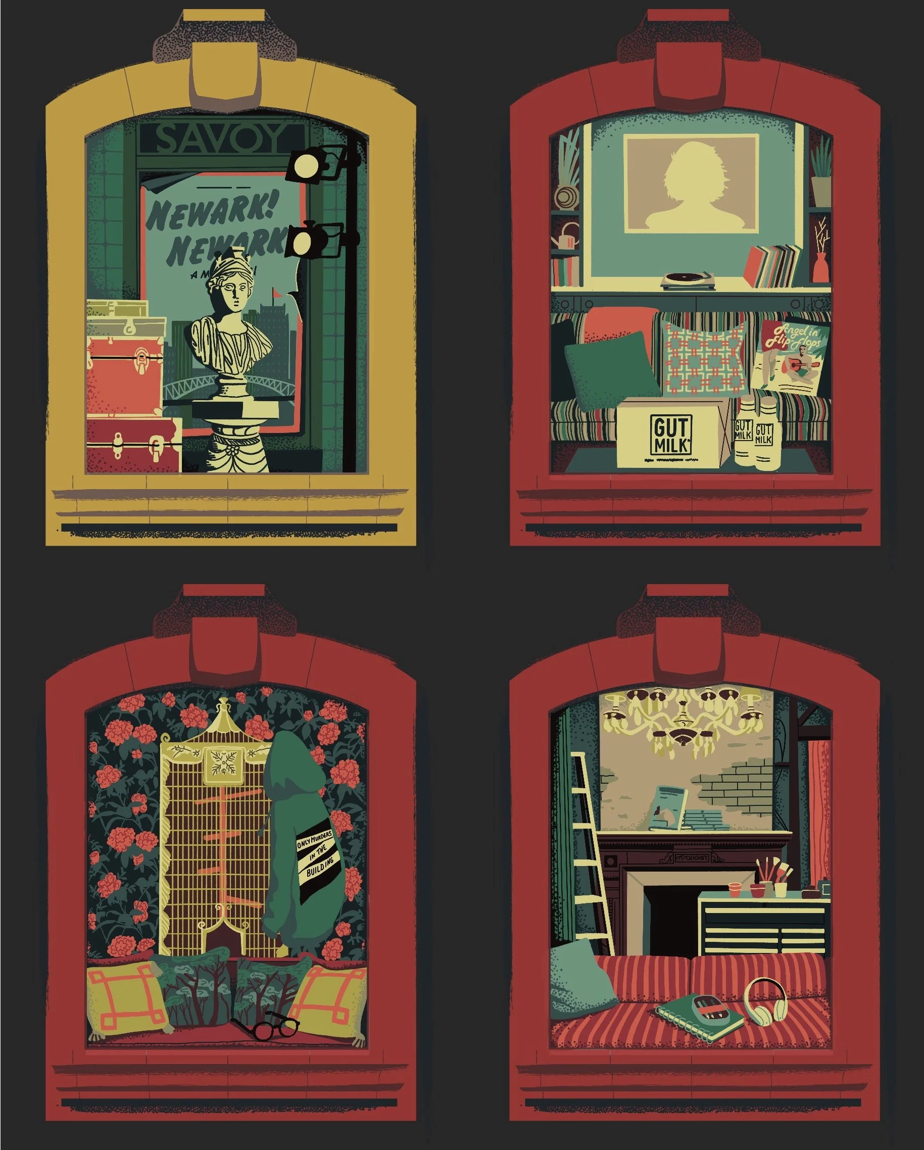
Work created for the board game version of the hit show Only Murders In The Building.